Friday 23 March 2012

NEWS HAS BEEN TRANSFORMED IN THE ONLINE AGE “TO WHAT EXTENT DO YOU AGREE WITH THIS STATEMENT. APPLY CONTEMPORARY EXAMPLES TO THIS STATEMENTS”.


     I agree with this statement, news has changed significantly in the online age. It has become easier to reach audiences with news through posting articles online. It has also become more accessible for the public to view articles they are interested in, we have the vast amount of news websites, which focus on a wide range from politics to celebrities.
     A modern example that you could apply to this statement is the new campaign “Kony 2012”. This first surfaced by the effects of a short film premiered (March 5th) on you tube created by the charity ‘Invisible Children’ and directed by Jason Russell. The video has now reached over 85 million views in less than a month. Online news has also allowed the public to comment on the articles. The Kony 2012 campaign disabled the comments section on you tube as the public were disliking the video and posting negative comments.
     The public have become much more important for the news in the online age. To grab an audience and to compete with other news companies the articles they put out have to be accompanied with either images, audio or video or all of these to make them stand out and be as interesting to the audience as possible. News doesn’t only get distributed on the companies websites but also via a twitter or Facebook feed allowing the audience/public have news delivered to their phones.
     The news in much more constructed and put together. The gatekeepers choose which stories to show and which to dismiss. They then construct the news stories with pictures/audio/videos and then they sell the story through having it has their headline posting it on their twitter site. Breaking News has become more accessible for the public as you are able to hear about it as soon as it is announced. The main aim of the news company is of course to make money. They achieve this through advertising revenue, this has an impact on news values and news selection.
     Tim Lee invented the internet thinking it would bring people together, which is what has happened through Facebook twitter etc. David Gauntlett says “He imagined that browsing the web would be a matter of writing & editing, not just researching and reading”. More than 1/3 of people in the world have a facebook account, this lets the news companies reach an audience through online networking, cheaply and effectively. More and more people and participating in online communities, which regularly revolve around current news stories (what happened with Kony 2012).
     Mark Poster says the internet provides a “Habermasian public sphere”, which means a cyber democratic network and points of view, which ultimately lead to a ‘public opinion’. The internet is also a huge source for the news companies to retrieve information. Also as the internet creates communities these communities are also brought together through news stories. Now the public/audience participate in news stories and contribute to the news. For example after 9/11 many videos/photographs/statements captured by the public were then transferred and printed/displayed across the globe.
     The online age has had a huge effect on how News is delivered the public. It is much more accessible that how it was before Web 2.0

Saturday 17 March 2012

Using Photoshop

When constructing our CD digipak and poster we had a photoshoot this allowed us to have initial material to work with and to manipulate. During the photoshoot we used a Cannon 500D, this allowed us to capture the detail and the clarity, which then gave us more flexibility when editing and manipulating the image.

We turned to PhotoShop to edit & perfect our pictures. We needed to create a 6 panel CD digipak and an  poster to compliment our pop promo video. Photoshop is a image manipulation device which allows us to create new images from outstanding ones. Perfecting our star image is crucial for us as her image is what will sell her.


The first thing we did before using photoshop was to chose the images we wanted for our products. We then started work first on the CD digipak. We sourced a template from the internet of a 6 panel CD pack and then layered all the images we previously selected up against this. The main image for us to edit was the front cover which we did by selecting the picture and then cropping it to fit the square frame. We then duplicated the layer to enable us to airbrush the image of our artist to create a flawless 1920's look. We the decided to create another layer to add the text. We chose a font that we wanted throughout the ancillary texts to create a sense of synergy. We got pictures of art deco frames and lines which we added ontop of our own photos to highlight the 1920's era and link the text back to our video. We then used the colour manipulation tools to alter the lighting and contrast of the image to look like the colours we used in the video. We did similar things for the other panels where we used the 'eye dropper' tool to choose a colour from our video and then place this on the panel.


As we were aiming to create an art deco/modern twisted album cover we needed to research and get inspiration for our album cover.
Modern album cover, showing iconic status (Marilyn Monroe), Sexual.

Art Deco design, Use of block colours, straight lines, squares, precise.


When creating our poster we chose to follow the idea of one of our digipak panels which would create a sense of synergy. We used the eye dropper tool to select the same colour as the panel and then chose the same silhouette image of the dancer to place on our poster. We did this by using the marquee tool to draw around one of the three silhouettes and then copy and paste it onto the poster. We then used the transform tool to scale it to the size we wanted. And added the same font in the similar positioning on the poster as on the digipak. We created a new layer to add text to the poster which included tour dates where the artist would be performing. We saved images of the twitter and FaceBook logo to place on the bottom of the poster in their own layers and then found a barcode on google to place ontop of the poster. Once we had created it we though somethig was missing so we added a new layer and used the brush tool to add a signiture of the artist in a similar colour as what would be found in the video, over the top of the silhouette.

We also created a few different posters in photoshop that we decided we didnt want to use as our final poster. These followed the same similar ideas as the final poster, we just used the colour contrast and highlighter tool to get the block effects which we then selected and added different colurs to.


Friday 16 March 2012

Photoshoot & Digi-Pack

After we had finished the shoot we then started the photoshoot. We 
decided to keep the "Dancing Girls" as we felt they would compliment and create a more interesting frame around our leading cast member (Georgina).

We then decided to get shots of the Dancers so we could possibly use them in the digi-pack. When editing we colour corrected the photos so they looked old fashioned but still classy.

  We then needed to capture more shots of just Georgina as she is the artist/band we are selling. When editing this photo again we colour corrected the image like the one above to make it look classy and old fashioned.

In this photo below instead of correcting the colour we decided to put the photo into black & white, which made the photo look more sophisticated. This seemed to fit well with the theme of the music video.

For the photo below we tried editing it and changing the colours in the photo but none of them could match the original colour photo. This photo is a close-up of Georgina. We all agree that this photo has potential to be used for the digi-pack or the poster.

In the photo below of Georgina we tried to edit to make it seem aged and grainy to portray the era of the original track "Why Don't You" by Peggy. I feel the photo is slightly to edited but think it has potential to be used somewhere in the digi-pack or poster if we spend more time on it.

Friday 10 February 2012

Feedback - Directors Commentary

Excellent and considerate understanding of the technologies used in production of the video for example After effects and FCP..  There are evident links between creative decision making and use of technology on both productions of the video using professional digital cameras (e.g focus pulls) and in the post production editing process – in discussion of continuity.  This is sustained and thorough and accurate in discussion of the art deco themes of the MV.  The commentary shows a discrete awareness of the use of new media technology and uses discriminating examples really well in terms of graphic design and animation.  Excellent command of terminology and well presented.

Covers sound and technology. Exemplifies After Effects well and the use of chromokey as an effect.  Excellent commentary, well done.

Feedback on Director's Commentary

Evaluation Task 4

Wednesday 8 February 2012

Task 4: Media Technology in Pre-Production

Before we started filming & editing our music video, we instead drew out a storyboard of what we visualised our shots to look like. We then put our storyboards up on the wall so we could film each 'shot' that was drawn out. We used a Sony NX 5 to shoot them and then we edited all these shots together using Final Cut and synced the shots up to our song. Therefore, we basically had a rough cut of our actual music videos. This proves how media technologies allowed us to get a feel for what our music video would look like and therefore change anything which we didn't thnik fit the song. This was crucial as our storyboard animation allowed us to realise that we had some shots at the end that were too slow and that we did not have enough intense action in our video. We then had time to think about this and establish the changes before the shooting day. Thus, this media technology was a significant part in our pre-production and our music video may not have turned out as well without our storyboard animatic. We researched all of our material using new media technology (Google, Youtube, Flickr). 

Friday 27 January 2012

Feedback on Evaluation Task 3: Audience Feedback

Can you please comlpete over the weekend.  You need to address the evaluation task set and in relation to reception theory and the strengths and weakness in your production work.


Monday 23 January 2012

What's the point of doing a FOCUS GROUP?

doing a focus group will allow us to get audience feedback and see what our video accomplished and also what the video lacked.

We will be asking our target audience (mainly female, 16-25).

We will be asking questions like;

- What did you enjoy in the music video?
- What did you not enjoy in the music video?
- Do you think our target audience is the right audience?
- Where would expect to see this music video (MTV)?
- Do you think there should be more narrative?
- Do you think there should be more performance in the music video?
- What else would you want to see in this video?
- Does the music video seem amateur?
- Is the editing smooth or unnatural? and is this effective or not?
- Would you watch this video again?
- Does the music video show the "Star" in a positive light?
- What does she portray (Fashion Icon, Celebrity)?

Example of a focus group, which we can take advice from.


Feedback

The presentation is proficient which has a clear presenation of how your MV and ancilliary tasks work together. I feel you have been clear in what you want have wanted to promote with the artist image and thought carefully about product placement. However I do feel that you need to discuss the star image of your artist in relation to Dyer and consider how you have branded the image you wanted to. Then address the the effectiveness of the question set which is asking you to evaluate how well the products work together in a marketing mix - as per the argument of Philip Kotler (please refer to your class notes).

Monday 16 January 2012

Digi Pack/Music Video Conventions TASK 1

Image of Star: This is a vital part of the campaign to market & distribute the artists music. As our artist is a        newcomer this was even more important so that the audience knew who the artist was.

Main Title: Having a title on the CD is another crucial part of promoting your artist, it lets the audience know who they are listening to. On our album we used our artists name, which is common is albums.

"Featuring No.1 Single Why Don't You" = This lets the audience know that the artist is popular and will urge the audience to buy the album. This is common marketing.

Linking Our Digi Pack & Music Video Concept Ideas: We wanted to make our Music Video & Digi-Pack similar so thats why we added an Art Deco pattern as a border round the front panel of the album cover. This also gives the audience an idea of what the music style is.


Above is "Night & Day The very best music of Cole Porter". This album cover shares the same concept as ours but also has the same conventions but also goes against a few. It has a title naming the artist. But what it lacks is the star image.


The conventions that are shown on the back panel of the album. These are the record label. The record label the artist is signed to is always on the back of albums, this allows the consumer to know what type of genre it is and also what the scale is (commercial or independent).

As we listed our tracks this means we conformed to the media conventions of a CD digi-pack. The track listing sometimes could suggest the genre of the music and the style, if the songs were titled "it's all about love" then you would know its a pop commercial album but if they were more edgy you would know they were more indie.

The bar code at the bottom left conforms to every possible media product.

The art deco patterns around the album is our theme, which is another convention as most albums would have a theme. This helps build our star image.

The art deco patterns and colour also relates to our Music Video, this links our products together starting a 'mini' franchise.

We also added a copyright sign, which again conforms to every media product to stop people stealing the product.

Last of all and probably the most obvious we had the CD digi-pack square, this conforms to most if not all CDs.


Saturday 14 January 2012

Feedback

Can you please post evaluation task 1 and email me when this is completed.  Thank you.

Sunday 27 November 2011

Feedback

It is good what has been posted, but does not completely evaluate the process, in particular you need to give more attention to the concept f your audience and any potential feedback they could offer.  Well presented in terms of what has been blogged.

Friday 25 November 2011

CD Poster & Digi-Pack


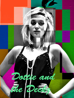
   When coming up with ideas for our poster, we decided that it needed to focus on the leading artist and that it had to relate in some way or another to the digi-pack. So we thought of doing something similar to Andy-Warhol in a pop art style. Although this turned out for the better for the CD Digi-Pack It didn't seem to suit the poster. 
   We then came up with a stylased idea of having plenty of shapes scattered around the image with different shades of black & white. This idea would have a modern twist on it against the 1920's costume.

    After drawing up sketches of these ideas this is what we came up with (Below). We felt it was a nice juxtaposing poster, and felt it was eye-catching and very original.

here we have experimented with different medias, i have started with air brushing and enhancing areas such as eyes, hair etc. I then decided to try different areas of the image in black and white squares, this was to convey the ideas of the art deco that they had in the 20's as well as the modernising of an old song to reflect the poster. 


I started with a colored image or georgina that I air brushed and enhanced the eyes etc, Then I selected different areas of the image with the select tool and changed the hues, saturations and brightness of the different parts.  

  We then decided to repeat this process but use colour to make it more modern. This turned out looking great as a series of posters.

Digi-Pack Treatment


For our CD pack we had a several ideas that we tried out using photoshop, to cut and edit.

IDEA ONE

            The first idea was of using a different image for the front and back covers. The first image would show the main singer only, we wanted this picture to be a close up with her in her 1920's costume and hair and make up to show what to except in the music. It would be edited using photoshop to manipulate the colour and make it look more like an old photograph rather than a CD cover. The name of our artist would appear vertically down the side of the front cover in a fancy red font.

The back cover would be a photo of the main singer and the 4 dancers, this would be on the set of the video with the pillars in the background to add sophistication to the image. We would write the track names vertically down one of the pillars in a red or black font, this would contrast with the older style and colours of the image.

The middle page would show the lyrics of the song on a plain black background, the text would be in red font.

IDEA 2

Our second idea would use the image of the front cover from the previous treatment, except the colouring would be different, we would make the image more like Andy Warholes pop art of Marilyn Monroe. Then for the back cover we would use the same image but again change its colouring, this would occur through each face of the pack. This idea came from a Michael Jackson album cover that we happened to stumble across whilst searching for ideas.


Aftere photoshopping both of these ideas we felt that the second idea/popart suited our themes more. And it looked more proffessional. I felt that the composition was also more attractive. The idea was also something we could maybe put through into the poster.


Saturday 19 November 2011

Feedback


There are some sound entries here and good reflection on the shoot day.   The use of photo's from the day are excellent, but could have been presented in a much better way as a slideshow or other presentation - this is an area for development to consider.
Also can you slightly reevaluate this and link your comments to that of production - consider film direction, set design, how the MV was shot etc - be as precise as possible with this and please post your CD design.
Nonetheless this excellent in aspect's - I do feel that you should fully evaluate the digipak.

Friday 18 November 2011

Digi-Pack designs

After spending a long time editing photos we then came up with several Digi-pack design ideas. This was the one that we were all the most keen on.

The inspiration came from Andy Warhol & Michael Jackson's Album Invincible. Both of these ideas we filtered ino our original ideas and the digi-pack is the final product that appeared at the end of this development stages.


We merged these two pieces of material and fused both of them with our original ideas and came up with a unique album artwork. I think it is simple yet effective and clearly markets our artist.

Thursday 17 November 2011

Account Of Shoot Day (2nd November)

     On Tuesday 2nd November was our shoot for our pop music video. The day before we placed the set in the studio, gathered all the costumes, collected all our props and painted the set. This planning reassured me when walking into the studio on the Tuesday morning knowing that everything was carefully planned and placed were it should be.

    We gathered the cast and crew and got everyone into their fitted costumes and started rehearsing with them to make them less nervous when it would come to shooting. We also told them our plans for the day so they knew when and where to be on the set throughout the shoot. Before we started shooting we looped the track so that our cast we were going to use first (Tunde & Ben) could practice and go over what they had rehearsed. When we began to start shooting they felt uncomfortable with the camera. After a while, we managed to get them to relax by reassuring they were doing a good job, which they certainly were. It was great to see them go from strength to strength from then on in.

  As we needed only Ben & Tunde in the morning we let our leading cast member (Georgina) out and told here to come back to the set at a specific time. We had scheduled a trumpet player to arrive at 11:30 to shoot some abstract shots of him against a green screen. And arriving at 10:50 was Connor, who was going to be doing a contrasting dance against a green screen. So we needed to get as much use out of Tunde & Ben as possible. By 10:20 we had managed to get wide shots, mid shots, and close up shots of the dancers (Ben & Tunde). So we had an extra half hour to use Ben & Tunde. We decided then to do more whacky shots, which involved doing extreme close ups and panning around the dancers. After getting plenty of interesting footage of Ben & Tunde Connor arrived in his costume.
  
     As a last minute idea we gave him a cane, which we asked him in some way to involve in his dance. As this footage we were going to shoot of Connor was going to be shown in a silhouette we asked him to make his dancing as large as possible so that it would show up in silhouette. To show Connor's characters status we shot up at him. We managed to get a nice amount of shots showing Connor dancing. A few of my favourites included; A close up of Connor's feet because it is energetic, which relates to the music. Another shot, which was one of my favourites of the day was when conner by mistake threw his cane across the studio. At the time it was a mistake but when we come to editing we thought how in post-production we could reverse it to create an illusion.

     As we finished with Connor the time was 11:25. We decided to have a 5 minute coffee break as we all had been working hard. at 11:30 we got back to the set and Miles (our trumpet player) was in his costume with his trumpet. We gave him the track the day before so he knew how the tune goes and he knew when to play. We shoot Close Ups, Mid Shots and Wide Shoots. To create a variety of shots we had him standing facing to the left, right and straight on. As this would work well in silhouette. Everything we shoot with miles was shot in front of the green screen.

       After we had breaked for lunch we set up the set for the afternoon, which consisted of wide stairs and large white columns.
 We then started to shoot the opening sequence of the track, which involved the Backing Dancers. We had choreographed them earlier on so they knew what they were doing and when in the track. We did a tracking shot for this section. We focused up on the backing dancers and then tracked forward to reveal Georgina. This was possibly one of my favourite shots of the day. But was took a lot of time to get right.

   After this we had to shot Georgina singing the old fashioned sections of the track. This was quick to shot as Georgina was comfortable with the camera. We then had one more tracking shot to do, to show Georgina walking across the set. This was particularly difficult as we had to track at the right speed so she would stay in the right place in the frame. 

When finished shooting this tracking shot it was a wrap!

Shoot Day (List Of Shots - Done in Sections)


while directing & filming the music video I managed to take notes of what shoots we had shoot so we could edit quicker but also easily know if we hadn't had enough shots for a certain section.

Part 1 - Opening Dance

- Two guys freestyle (Blue Background)
- Ben Close Up (Blue Background)
- Tunde Close Up (Blue Background)
- Tunde Extreme Close Up (Blue Background)
- Ben Extreme Close Up (Blue Background)
- Tunde Mid Close Up (Green Screen)
- Ben Mid Close Up (Green Screen)
- Ben Wide Shot Low (Green Screen)
- Tunde Wide Shot Low (Green Screen)
- Connor Wide (Green Screen)
- Mid Close Up Ben (Green Screen)
- Mid Close Up Tunde (Green Screen)
- Close Up Miles (Green Screen)
- Miles Wide Shot (Green Screen)
- Mile Wide Shot Right (Green Screen)
- Miles Close Up Shoes (Green Screen)
- Georgina Wide Shot (Green Screen)
- Georgina Close Up (Green Screen)
- Georgina Close Up Shoes (Green Screen)
- Connor Tap Close Up (Green Screen)

Part 2 - Old Skool

- Two guys clicking (Blue Background)
- Ben Close Up (Blue Background)
- Tunde Close Up (Blue Background)
- Tunde Extreme Close Up (Blue Backround)
- Ben Extreme Close Up (Blue Background)
- Tunde Mid Close Up (Green Screen)
- Ben Mid Close Up (Green Screen)
- Ben Wide Shot Low (Green Shot)
- Tunde Connor Wide (Green Screen)
- Wide Shot Low (Green Screen)
- Connor Wide (Green Screen)
- Conner Wide (Green Screen)
- Mid Close Up Ben (Green Screen)
- Mid Close Up Tunde (Green Screen)
- Miles Mid Left (Green Screen)
- Miles Mid Right (Green Screen)
- Miles Mid Straight (Green Screen)
- Miles Mid Both Sides (Green Screen)
- Miles Wide Shot (Green Screen)
- Miles Wide Shoot Right (Green Screen)
- Miles Close Up Shoes (Green Screen)
- Georgina Wide Shot (Green Screen)
- Georgina Close Up (Green Screen)
- Georgina Close Up Shoes (Green Screen)
- Connor Tap Close Up (Green Screen)

Part 3 - Dance

- Two guys feet kicking (Blue Background)
- Ben Close Up (Blue Background)
- Tunde Close Up (Blue Background)
- Tunde Extreme Close Up (Blue Background)
- Ben Extreme Close Up (Blue Background)
- Tunde Mid Close Up (Green Screen)
- Ben Mid Close Up (Green Screen)
- Ben Wide Shot Low (Green Screen)
- Tunde Wide Shot Low (Green Screen)
- Connor Wide (Green Screen)
- Mid Close Up Ben (Green Screen)
- Mid Close Up Tunde (Green Screen)
- Miles Wide Shot (Green Screen)
- Miles Wide Shoot Right (Green Screen)
- Miles Close Up Shoes (Green Screen)
- Georgina Wide Shot (Green Screen)
- Georgina Close Up (Green Screen)
- Georgina Close Up Shoes (Green Screen)
- Connor Tap Close Up (Green Screen)

Part 4 - Old Skool break

            - Tunde Close Up (Blue Background)
            - Tunde Extreme Close Up (Blue Background)
            - Ben Extreme Close Up (Blue Background)
            - Tunde Mid Close Up (Green Screen)
- Ben Mid Close Up (Green Screen)
- Ben Wide Shot Low (Green Screen)
- Tunde Wide Shot Low (Green Screen)
- Connor Wide (Green Screen)
- Ben Cane
- Mid Close Up Ben (Green Screen)
- Mid Close Up Tunde (Green Screen)
- Mid Close Up Tunde MIC (Green Screen)
- Miles Mid Trumpet Flip (Green Screen)
- Miles Close Trumpet Flip (Green Screen)
- Miles Wide Shot (Green Screen)
- Miles Wide Shot Right (Green Screen)
- Miles Close Up Shoes (Green Screen)
- Georgina Wide Shot (Green Screen)
- Georgina Mid Close Up (Green Scren)
- Georgina Close Up (Green Screen)
- Georgina Close Up Shoes (Green Screen)

Part 5 - DANCE

            - Tunde Close Up (Blue Background)
            - Tunde Extreme Close Up (Blue Background)
            - Ben Extreme Close Up (Blue Background)
            - Tunde Mid Close Up (Green Screen)
- Ben Mid Close Up (Green Screen)
- Ben Wide Shot Low (Green Screen)
- Tunde Wide Shot Low (Green Screen)
- Connor Wide (Green Screen)
- Mid Close Up Ben (Green Screen)
- Mid Close Up Tunde (Green Screen)
- Miles Wide Shot (Green Screen)
- Miles Wide Shot Right (Green Screen)
- Miles Close Up Shoes (Green Screen)
- Georgina Wide Shot (Green Screen)
- Georgina Close Up (Green Screen)

Part 6 - Break Short Old School

            - Tunde Close Up (Blue Background)
            - Tunde Extreme Close Up (Blue Background)
            - Tunde Mid Close Up (Green Screen)
            - Ben Mid Close Up (Green Screen)
            - Ben Wide Shot Low (Green Screen)
            - Tunde Wide Shot Low (Green Screen)
- Connor Wide (Green Screen)
- Mid Close Up Ben (Green Screen)
- Mid Close Up Tunde (Green Screen)
- Miles Wide Shot (Green Screen)
- Miles Wide Shot Right (Green Screen)
- Miles Close Up Shoes (Green Screen)
- Georgina Wide Shot (Green Screen)
- Georgina Mid Shot (Green Screen)
- Georgina Close Up (Green Screen)

Part 7 - Dance

            - Tunde Close Up (Blue Background)
            - Ben Extreme Close Up (Blue Background)
            - Tunde Mid Close Up (Green Screen)
- Ben Mid Close Up (Green Screen)
- Ben Wide Shot Low (Green Screen)
- Tunde Wide Shot Low (Green Screen)
- Connor Wide (Green Screen)
- Mid Close Up Ben (Green Screen)
- Mid Close Up Tunde (Green Screen)
- Miles Wide Shot (Green Screen)
- Miles Wide Shot Straight On (Green Screen)
- Georgina Wide Shot (Green Screen)
- Georgina Mid Shot (Green Screen)
- Georgina Close Up (Green Screen)

Part 8 - Old School Outro

            - Tunde Close Up (Blue Background)
            - Ben Extreme Close Up (Blue Background)
            - Tunde Mid Close Up (Green Screen
- Ben Mid Close Up (Green Screen)
- Ben Wide Shot Low (Green Screen)
- Tunde Wide Shot Low (Green Screen)
- Connor Wide (Green Screen)
- Mid Close Up Ben (Green Screen)
- Mid Close Up Tunde (Green Screen)
- Miles Wide Shot (Green Screen)
- Miles Wide Shot Straight On (Green Screen)
- Georgina Wide Shot (Green Screen)
- Georgina Close Up (Green Screen)


Friday 21 October 2011

Feedback

A proficient presentation of the CD digipak design and the importance of album covers. I feel that you could have developed research more into the conventions of Album digipak's and addressed layout and design more closely. Good initial research into CD covers for your group artist and good consideration to target audience. You do not to be completing what is required ina post - please revise the design's of your Cd digipak.

Digi-Pack

Sunday 16 October 2011

Feedback


This is sound work - there are evident clear accounts of your planning and research for your music video production day after half term.  I

The evaluation of the animatic requires more detail - see the notes you were provided with.  If anything when you evaluate, try to add more to your comments - otherwise this looks too concise in it's approach.

There are one or two ways to develop the blog.  First to begin using a wider range of blogging tools, if you can - there are lots of well presented images, but use of Flickr or powerpoint will increase the creativity that is shown on your blog.  

Second the valid, detailed and reflective comments that you make need to be developed further with  key media concepts and theoretical ideas;  for example, link the planning to star image,  or how set design and lighting link to mise en scene and/ or what model's of lighting you are using in relation to your set - key, fill, directional, discuss the intensity and colour and what you are trying to represent about your artist.  You do this in part, but again not in enough reflective detail .
This will help make a more thorough evaluation of your work. 
Well done.

Thursday 13 October 2011

Shoot Plan

08:30 AM: Gather cast and crew and talk through day
08:45 AM: Get into Costume/Makeup (Heather)
09:00 AM: Set up camera/tripod e.t.c 
09:15 AM: Start shooting close ups of Lead Singer
09:30 AM: Start shooting wide shots of Lead Singer
09:45 AM: Shoot the Zoetrobe (Close Ups/Mid Close Ups/Wide Shots)
11:00 AM: Wide Shots of Dancers on black rostra.
11:15 AM: Mid Shots of Dancers on black rostra.
11:30 AM: Dolly shots of Dancers on black rostra.
11:55 AM: Sillhouettes of Lead singer (poses against white backdrop)
12:15 AM: Breaking jewellary (Lead singer) to be reversed in post
12:30 AM: Coins falling to be reversed in post
12:45 AM: Lunch Break


01:20 PM: Finish Lunch and meet back in studio to get back into costume e.t.c
01:25 PM: Shoot Gramaphone with record on.
01:35 PM: Shoot DJ Decks and scratching.
01:50 PM: Shoot sillouettes (Mulitply slowly in post) against white.
02:15 PM: Ben & Tunde cleaning shoes (Close Up/Mide Shot)

02:30 PM: Roullette wheel spinning (be reversed in Post)
02:45 PM: Chair Crashing to the floor
02:55 PM: Shot of China Plates Falling and Smashing (Plates/mugs/glasses e.t.c)