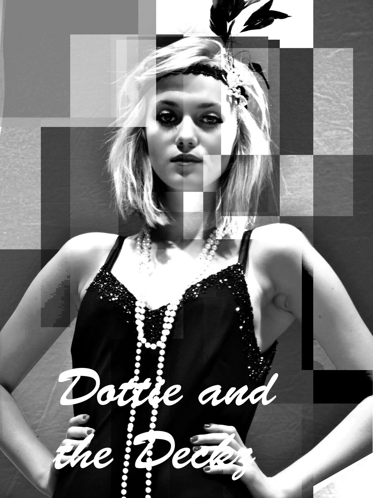
When coming up with ideas for our poster, we decided that it needed to focus on the leading artist and that it had to relate in some way or another to the digi-pack. So we thought of doing something similar to Andy-Warhol in a pop art style. Although this turned out for the better for the CD Digi-Pack It didn't seem to suit the poster.
We then came up with a stylased idea of having plenty of shapes scattered around the image with different shades of black & white. This idea would have a modern twist on it against the 1920's costume.
After drawing up sketches of these ideas this is what we came up with (Below). We felt it was a nice juxtaposing poster, and felt it was eye-catching and very original.
 |
| here we have experimented with different medias, i have started with air brushing and enhancing areas such as eyes, hair etc. I then decided to try different areas of the image in black and white squares, this was to convey the ideas of the art deco that they had in the 20's as well as the modernising of an old song to reflect the poster. |
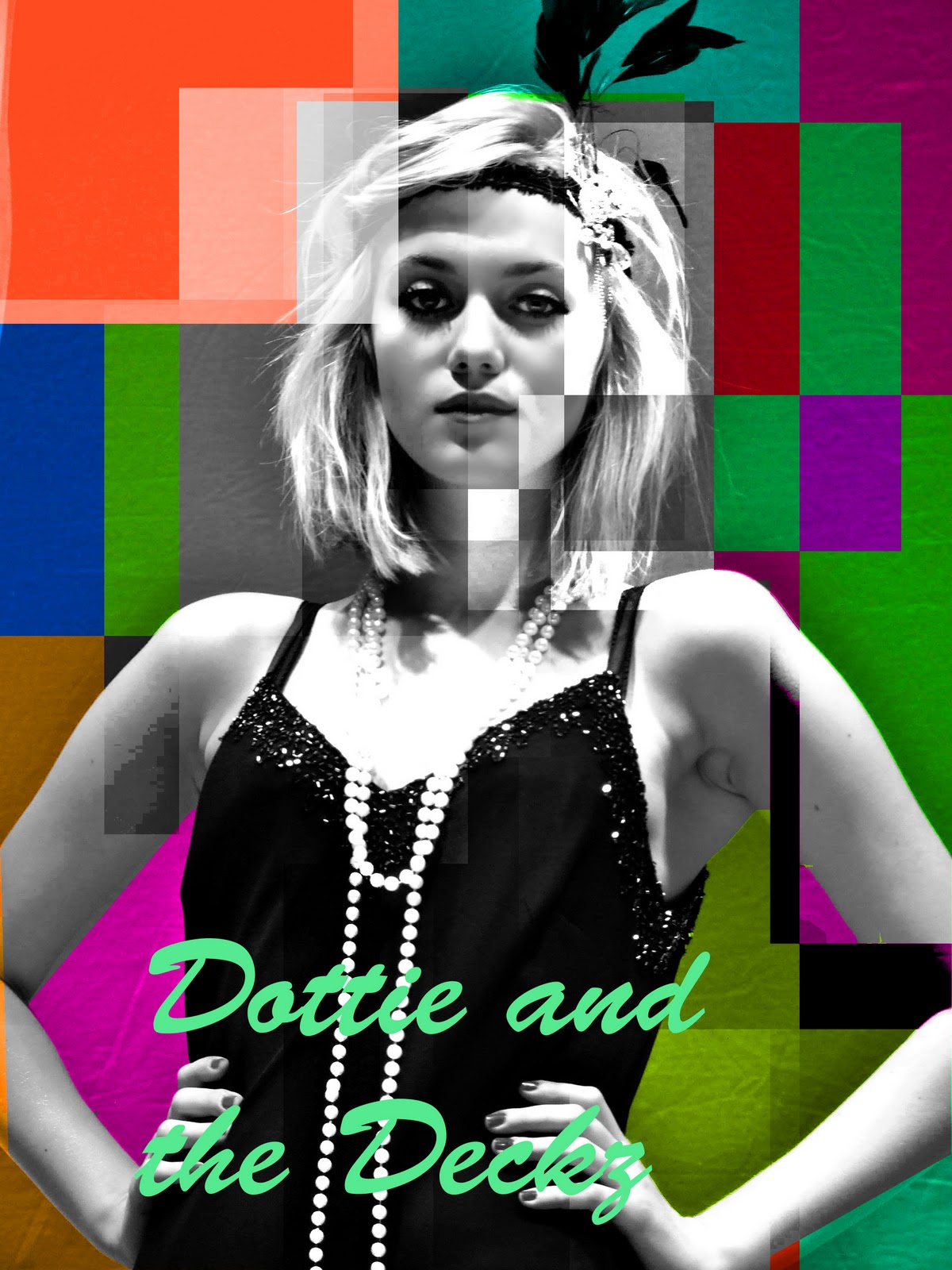 |
| I started with a colored image or georgina that I air brushed and enhanced the eyes etc, Then I selected different areas of the image with the select tool and changed the hues, saturations and brightness of the different parts. |
We then decided to repeat this process but use colour to make it more modern. This turned out looking great as a series of posters.
No comments:
Post a Comment